Statistics are like a map of baseball, guiding us to a better understanding of the game. This map is no longer the crude and primitive hand-drawn pictograph it was 150 years ago when not much information was collected beyond which team won or lost. Over time, the map has become more detailed. For some, it may feel like a tidal wave of tedious facts and figures ready to swallow them whole. Nevertheless, the map is our key to uncovering new ways to enjoy the game.
And this sense of exploration and discovery keeps baseball feeling familiar to us while offering a chance for new and exciting aspects of our national pastime to emerge. In this way, mapping baseball is not any different from mapping anything else. Human history is filled with pioneers who set out to find another path. Voyages were celebrated upon their successful returns. Adventurers gathered in circles with like-minded comrades, planning their next undertaking into the unknown. Through their work, the once-hand-drawn maps slowly evolved into GPS satellite tracking where a person’s smartphone can now tell their precise location.
Baseball is following a similar arc of history. Thinking back on those early games—even before there were professional leagues—statistics were an afterthought if they were even considered at all. There are now multiple channels available in many homes across the country from which a person can choose which ballgame they wish to watch that night. Professional clubs are now worth hundreds of millions of dollars, or perhaps, more than a billion. Yet, in all of that exponential growth—what, with the game played across the globe—parts of the map remain obscured.
How is it in 2021, with the power of supercomputers and an entire organization dedicated to advancing baseball research, that we still do not have a unified theory explaining how runs are produced? What good is a weighted formula that requires annual updates? Doesn’t that defeat the purpose of describing all runs if the algorithm can’t explain past, present, and future?
Sure, formulas have been put forth over the last sixty-plus years attempting to quantify the lifeblood of baseball. The researchers who toiled in the shadows of the game brought us closer to just such an epiphany. They were the cartographers who mapped out the dark spaces so that we might benefit from their labor of love. Unfortunately, with as many questions as were answered by their discoveries, more questions arose. And still, the nagging question of where—exactly—runs come from remained.
It’s been a passion of mine for years. I kept statistics as young as seven years old because my computer game lacked sophisticated programming. Thirty-seven years later, I admit that I tremble, grin and wipe sweat from my palms in succession as I write this. You see, I am one of those amateur researchers. I cannot overemphasize the amateur aspect of my efforts. Outside of my college-level stats class, a semester running a graduate research lab, and my lifelong love of statistics, I have no other credentials which qualify me any more than anyone else. Still, I was determined to put my mind to finding a unified theory that accurately explains where all runs in professional baseball come from.
Actually, it didn’t begin that way at all. Initially, I intended only to create a couple of new statistics for nothing more than my own enjoyment. I am not a fan of “wins above replacement.” In fact, I wrote two articles lamenting the clumsiness of it over the last six weeks. I even had the surreal pleasure of publishing one in which I celebrated the accomplishments of Pedro Martinez while on a much-needed family vacation to his native Dominican Republic. You see, I’m also an amateur writer. You have to make money to call yourself a professional at something.
As I said, I set out to create two new statistics for myself. Yet, as I began to tinker under the hood, I couldn’t shake a distressing feeling that every assumption I relied on led me down a dead-end path. I needed or wanted, rather, my two new metrics to complement one another. I was looking for a way to truly compare players from different eras and across the invisible batter-pitcher barrier.
WAR—as it’s known among the hardcore statistics hounds—didn’t cut it for me. Essentially, it heavily favors players who played at a time when the per-game workload simply wasn’t as taxing on individuals as it is today. Moreover, with rare exception, I do not, for the briefest of moments, believe that players from before 1900 would stand a chance in the modern game. Without venturing too far off-track, I realized that the current generation of metrics—better than their predecessors they may be—were not sufficient for my exacting standards.
Given how it’s turned out, I am grateful to have been detoured. I set aside the player evaluation metrics I wanted to draft. I focused my energy on the data I assumed provided the foundation for the other metrics I originally intended only to tweak. What I found was, well, surprising.
I told my wife on more than one occasion that I simply could not find enough supporting evidence in the data. I was puzzled. I have great respect and admiration for the work of other statisticians, both professional and amateur, who tackle this sort of beast. There is always uncertainty in exploration. All mapmaking starts with assumptions. It’s the same in statistical modeling. You either start with a known fact or the most reasonable hypothesis you can form. If you’re lucky, you get to start with both.
I spent the better part of six weeks dissecting different ideas. I tested, retested, tore apart, and put back together five significant variations of a working formula that had me seeing numbers floating in front of my eyes like I was Alan Garner at the blackjack table from the movie The Hangover. In so doing, I knew I was either a fool or had stumbled my way into something bigger than I could have imagined. I said as much to anyone willing to listen to me drone on about correlations, standard deviations, root mean squares, and the like.
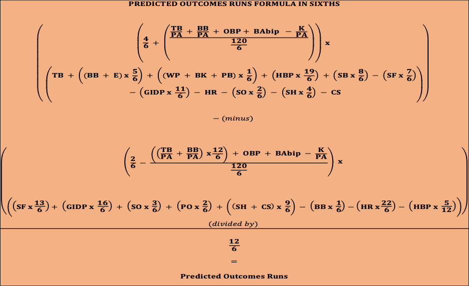
So, without further ado, I present the Predicted Outcomes Runs formula and algorithm:
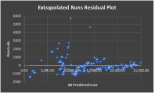
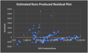
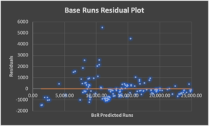
I can’t continue without acknowledging the statistical significance other run estimation algorithms have. They are very good with time-specific data sets. They offer a high degree of accuracy for the years they have studied. I know this because I studied and dissected their theories as part of my investigation. Where they fell short was in providing a theory that explains all runs.
The Predicted Outcomes Runs (POR) algorithm does three things. It describes in great detail what we knew but couldn’t previously prove; it presents statistically significant inferences that considerably reduce the gaps in lost or unrecorded data; it demonstrates the ability to predict future runs with a high degree of accuracy. (I won’t put you to sleep with too many details here, though I will make a technical report available on this blog in the next day or two.)
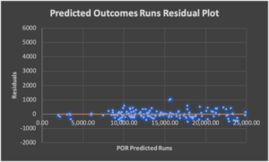
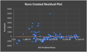
The standard deviation for the POR algorithm is less than one-fifth of its closest tested competitor. That’s a fancy way of saying the margin of error in my work is just over two percent while the rest are above eleven percent. On average, I account for one-hundred percent of the runs in any given year. Of course, there are outliers in any data set. I can account for 139 of 146 years of major leagues baseball within four percent of the actual results. The next closest competitor offers that level of accuracy for only 88 of the same 146 years.
For the “modern” era of baseball—1901 to the present—I have the margin of error well under two percent. I also have the average runs-per-team-per-game error down to 0.0 runs. The bottom line is I am incredibly excited about the formula and its use as a descriptive or predictive algorithm. The final tidbit of data I will share here is referred to as the sum of squares results. In layman’s terms, it describes how well a data model explains the variance or potential error in any data set. Other models admittedly boast impressive results. Analyzing their algorithms shows they each explain just over 96 percent of the model’s variance. POR can explain 99.7 percent of the variance. This additional three percent is the accuracy required in mapmaking to use our smartphones as GPS devices. The algorithm is wrong less than three out of 1,000 times.
POR is different because it discards previous assumptions about runs. The only thing that mattered to me was describing how the events of baseball games—you know, at-bats, home runs, wild pitches, etc.—impacted the runs that are scored.
POR is radically different in the lens it uses to look at each game and its related events. For starters, a baseball game is divided into nine sets of sixths. We call these innings. There’s a top and a bottom to each inning that does not end until the defense has recorded three outs. POR also moves away from using seemingly archaic percentages to weigh a game divided into sixths. Each event in the formula—thirty-three separate variables—is fractionally represented as a sixth or a multiple of a sixth. Why would we want to contort a game so symmetrically divided any other way?
In closing, I want to encourage others to take my work and improve upon it. I’m confident more imaginative minds than mine can tweak this formula to further our exploration of the game. I give you this map so that we can all find something new to love about baseball.
CALCULATOR:
Predicted Outcomes Runs Calculator for Excel, no macro-enabled reset button (contact me directly if you want a version that contains the reset button enabled).
CHARTS:
Residual Analysis: This is a measure of how much error exists in each algorithm.
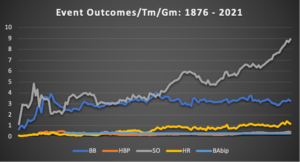
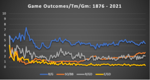
Outcomes Analysis: These charts illustrate the event and game outcomes since 1876.